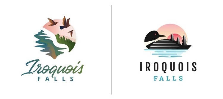
The town of Iroquois Falls is using a re-branding exercise to help re-invent itself, and bring in new visitors, residents and investors. Right now, it’s looking for its residents’ thoughts on a new logo.
Clerk-administrator Linda McLean explains that there are two options created by graphic artists at its Ottawa-based consultant’s office, Cinnamon Toast New Media Incorporated.
“The first logo is designed to reflect Iroquois Falls’ woodsy and scenic qualities,” she outlines, “and the second logo is meant to feature Iroquois Falls’ distinct northern attributes with the loon being its core symbol.”
McLean adds that the loon symbolizes tranquility and the awakening of new hopes and dreams, while trees are the peace and safety of the town.
There are also four suggested taglines.
“Those are ‘Imagine IF’; ‘The northern Wild Card’; ‘The Wild Card of the North;’ and ‘The North in Living Colour’,” says McLean. “So that’s part of our survey as well, so we’re hoping to get some feedback on the logos and the taglines.”
The survey is on until December 11th right here. The results go to council on the 16th. It might make a final decision that night.


